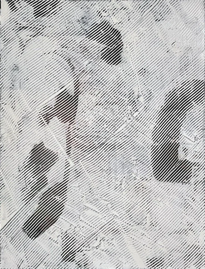
Disturbance occupies its five-by-four-foot field as a surface that has already been through something. The palette, red against dark purple against black with ochre cutting through, refuses to rest against the near-monochrome classification of its collection; color is technically spare but thermally insistent. The work does not depict restlessness so much as demonstrate it, each mark organized by reaction rather than composition.
The Abstraction Quotient is 3. At that distance from the recognizable, form collapses to a score of 1 while texture climbs to 5, and the consequence of that pairing is a painting that communicates not through shape but through surface behavior. The low mood score, a 2, sits in productive tension with that maximal texture: what reads somatically as agitation is tonally kept from spectacle, which is where the painting earns its title without illustrating it.
The risk Disturbance takes is refusing resolution while also refusing drama. Against the broader catalog it occupies unusual ground, thermally loaded yet formally reduced, which costs it immediate legibility but buys it duration. The work that refuses to dramatize its own disturbance tends to outlast the work that doesn't.
Restlessness
trembling beneath still surface coiling
STANDING THERE
something in the body recognized this before the eyes finished looking
WHAT LINGERS
the black presses in not as darkness but as accumulated weight that has nowhere left to go
WHO IT FINDS
the white is not light but the held breath between one unbearable moment and the next
Where it lives
- LIGHT
- Any lighting — monochrome palette is lighting-agnostic
- MINIMUM CEILING
- 9 ft
- MINIMUM WALL
- 8 ft
- DAYLIGHT
- Monochrome palette works anywhere — most flexible collection