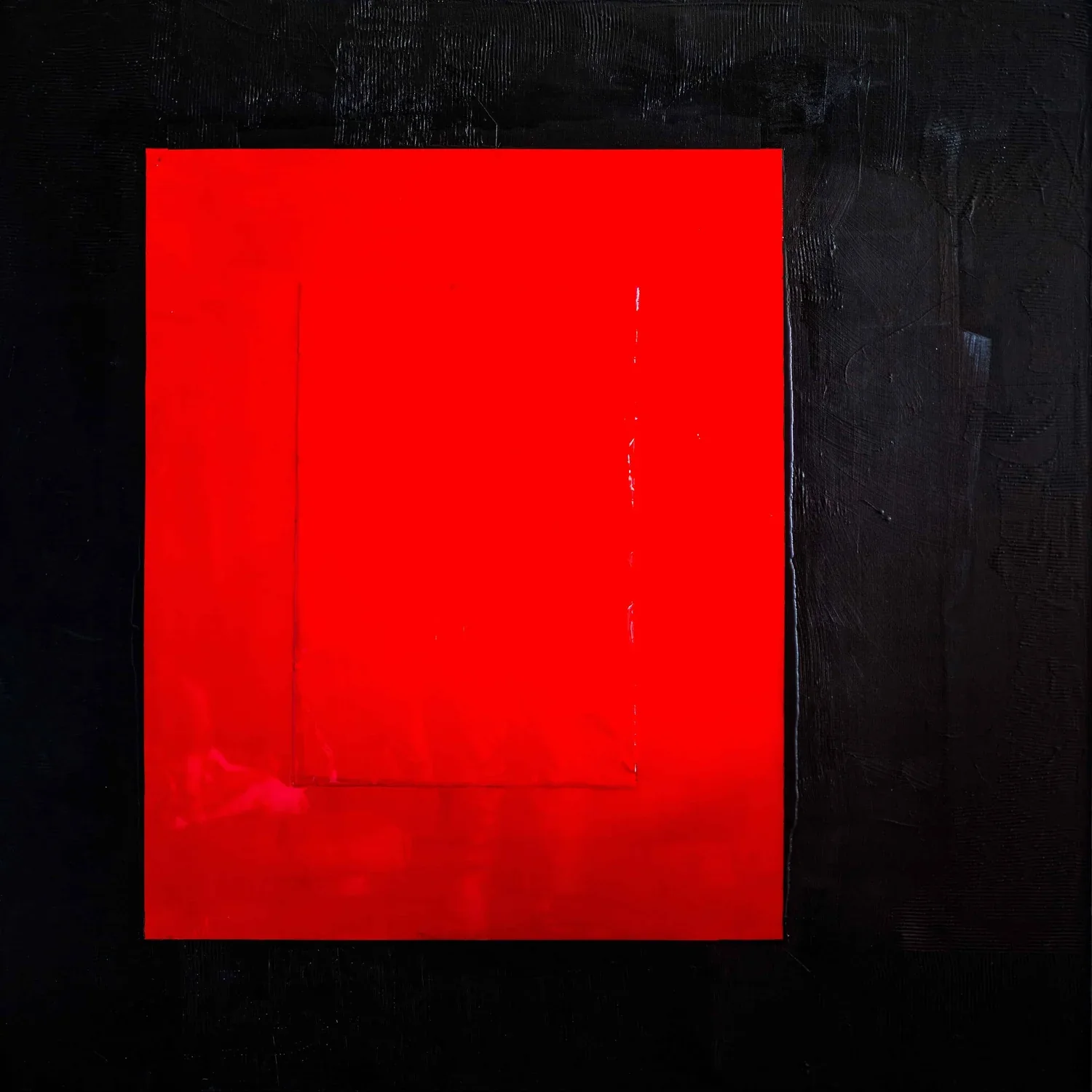
Ferrari Core occupies its six-foot square with the deliberateness of a closed system. The canvas gives back only red and black, colors that have accrued enough cultural velocity to arrive pre-charged, and Raj turns that charge into the painting's central problem: how much meaning can pigment carry before it collapses into symbol.
The work refuses the legible at every level it can afford to. An Abstraction Quotient of 3 explains the terms of that refusal: something survives recognition, but barely, and what survives is heat rather than object. Read alongside a Form score of 5 and a Color Range of 2, the painting's strategy clarifies. Total formal dissolution pressed against radical chromatic restriction produces not openness but compression. The field tightens because it has nowhere else to go.
Against the broader catalog, Ferrari Core is a gamble on iconicity. It borrows the most loaded color in consumer culture and asks painting to launder that association into something harder. The risk is that the painting remains a test of the viewer's capacity to forget the brand. The refusal is to explain itself. Whether those two gestures are sufficient is what criticism, and the catalog, have to sit with.
Awe
coiled force breathless stillness threshold
STANDING THERE
You stand before something that knows exactly how much power it is choosing not to release.
WHAT LINGERS
The containment itself becomes the subject — not the explosion, but the decision against it.
WHO IT FINDS
Something in you recognizes the discipline of holding your own magnitude quietly inside its own borders.
Where it lives
- LIGHT
- Natural light preferred — oil layers shift through the day
- MINIMUM CEILING
- 9 ft
- MINIMUM WALL
- 8 ft
- DAYLIGHT
- Natural light from nearby glass enhances layering — flexible